


Description
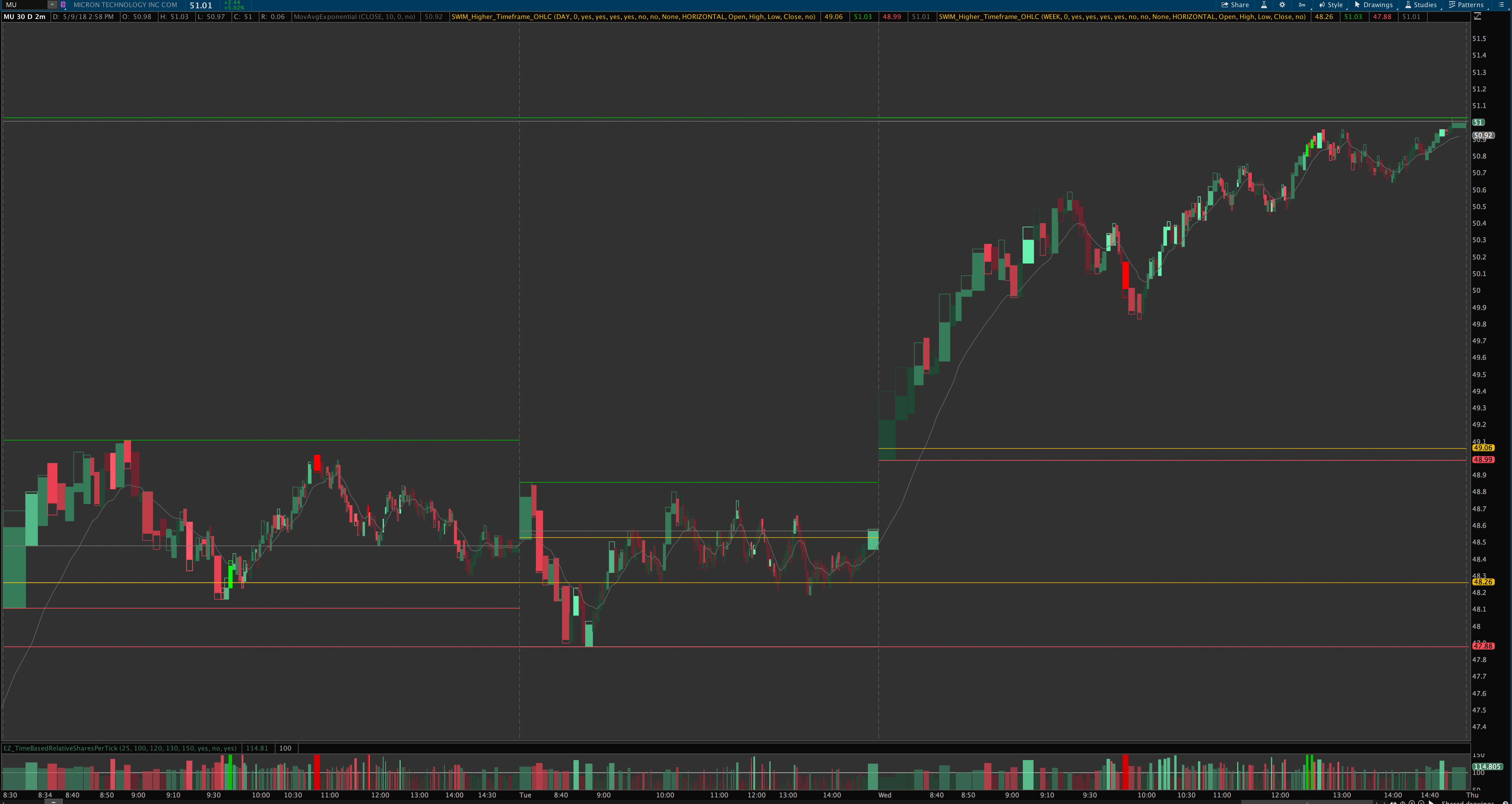
The NEW Big Levels indicator plots the higher timeframe open, high, low, close, VWAP, and midpoint for a specified timeframe (hour, day, week, month, quarter, year, etc.) on a lower timeframe chart. Say you’re trading on a 5 minute chart, and you want to be aware of important nearby price levels. You can add the OHLC levels for the prior day, prior week, prior month, etc. You can also add the levels for the current day, week, month, etc., or 3 days ago, or the current 3-day bar, or any other combinations you can think of. You can selectively turn off certain values you don’t want (the closing price for the current day, for instance). You can even fill in the range with an optional a “candle cloud” showing what the higher timeframe’s candle looks like. All in all, a very useful indicator for keeping track of important support and resistance levels and the higher timeframe trends!
NEW version 2.2 includes summary labels! Turn everything else off and just see the prices in labels if you want, or use them all together, either way!

Demo Video

Screenshots


FAQs
Q: Does the daily OHLC take into account premarket or aftermarket data?
A: No, it only shows the OHLC for regular trading hours data, not the premarket high/low, because that is what the higher timeframes like the daily candle and so forth are formed based upon (for premarket levels you might check out the premarket high/low range indicator). The only exception to this is on an intraday chart: say you’re on a 5′ chart with extended hours turned on, and have the indicator set to plot another intraday timeframe’s levels such as the 30′ or 60′ levels. Then it would show the 30′ or 60′ levels throughout the extended hours on the 5′ timeframe chart. But you would not be able to see daily including extended hours on the same 5′ chart unfortunately.
Q: What is version fixed length vs. periodic?
A: You actually get both. They both plot the same important levels, but “periodic length” plots them only for the duration the chosen timeframe (i.e., only during the day they’re actually plotting levels for), whereas “fixed length” allows you to stretch the levels all the way across the screen whether it’s on the current day or not, and it also allows you to put the bubbles on the left side instead of the right. Some people prefer it one way and some the other, so you get to pick, or use both if you want!
Questions?
Email me here or leave a comment below!


